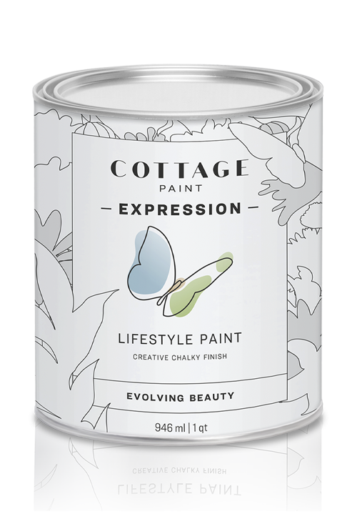
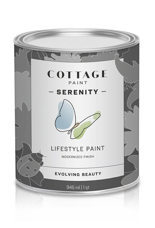
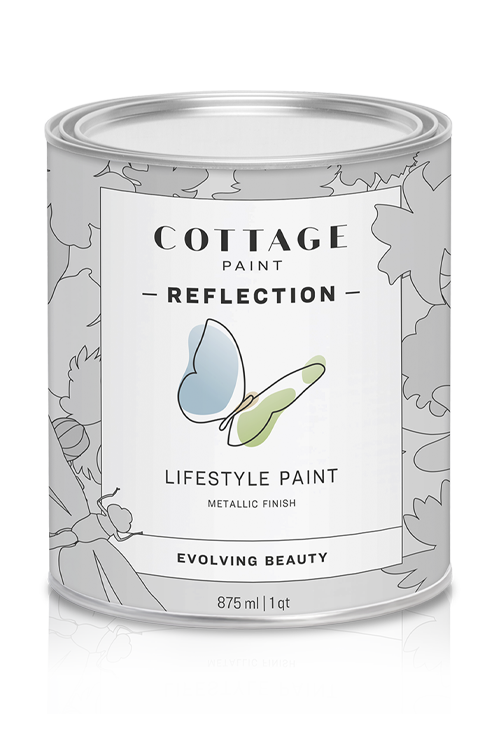
Among our more than 58 different chromatic palettes, you will find the perfect shades to feel an unprecedented creative freedom to express your true colours. Here is some advice to make the process more enjoyable.
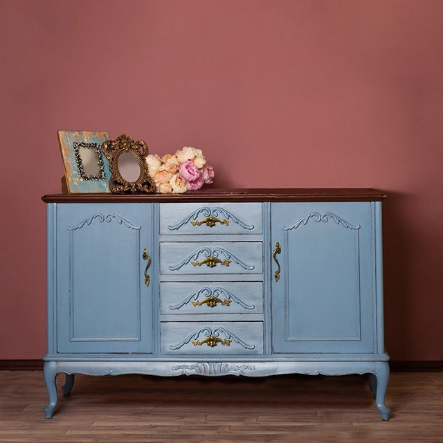
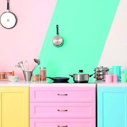
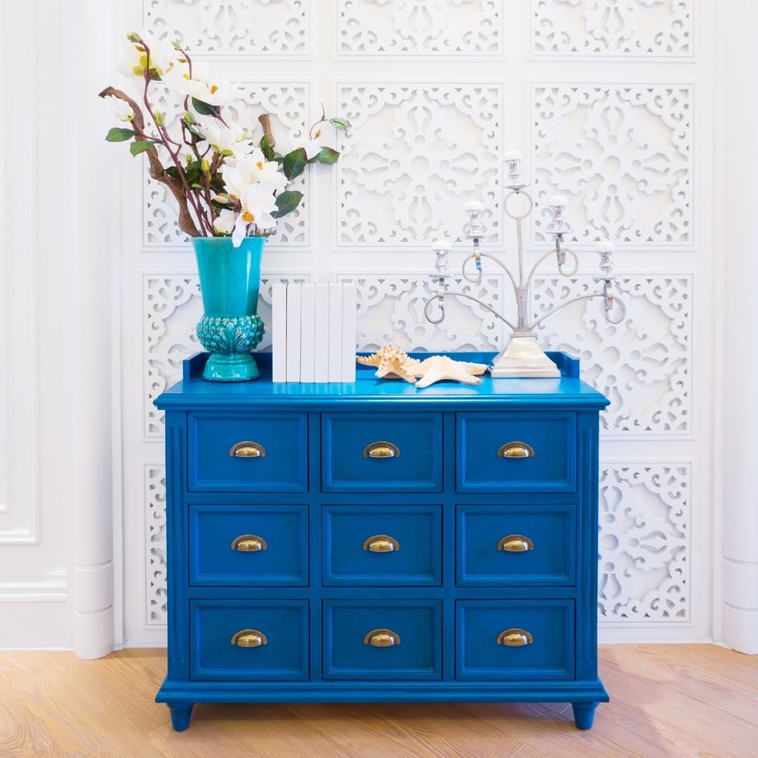
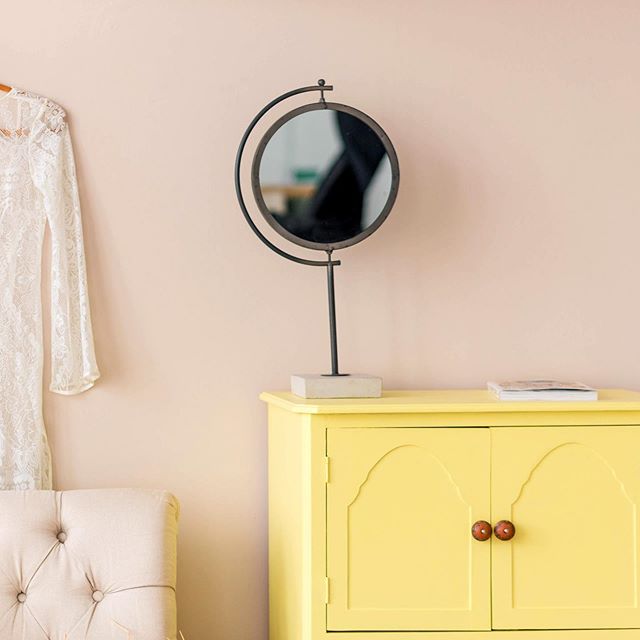
Get rid of prejudices. Colours have the meaning you give them. Blue can be for girls and green can make a beautiful kitchen cabinet shade. Dare to change your mind!
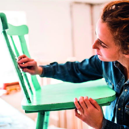
Nothing lasts forever. Choosing a colour should be fun. Please, do not stress or get nervous. If by the end of a year you end up disliking that purple shade you chose, just paint over it! It´s as simple as that.
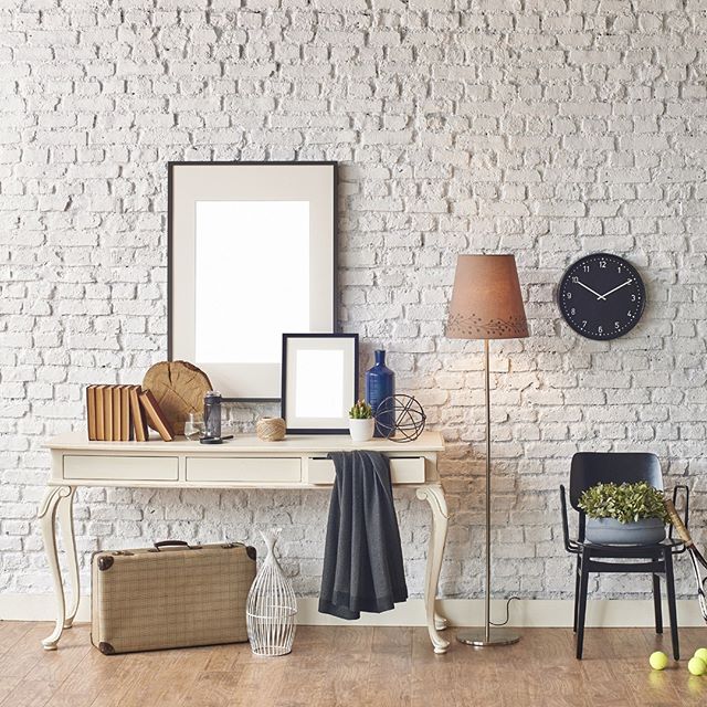
Observe your surroundings. Sometimes the objects you own give you a hint of a great colour combinations you already love.
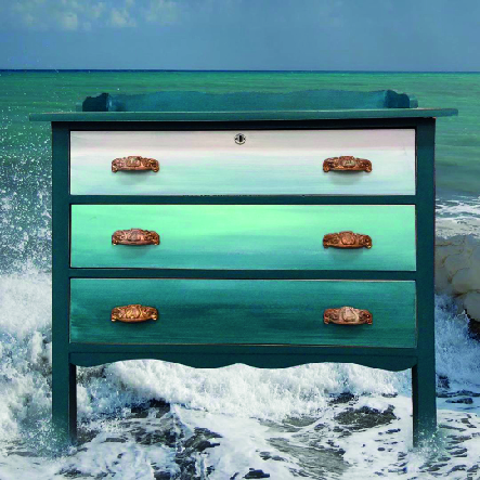
If you are feeling more philosophical, do as we did when we created our colour palettes: take a walk outside and get inspired by nature’s breathtaking colours.
Memories make the best colour references. Close your eyes and picture that time when you were happiest. What colour tones do you recall? Perhaps those are the next shades to choose.
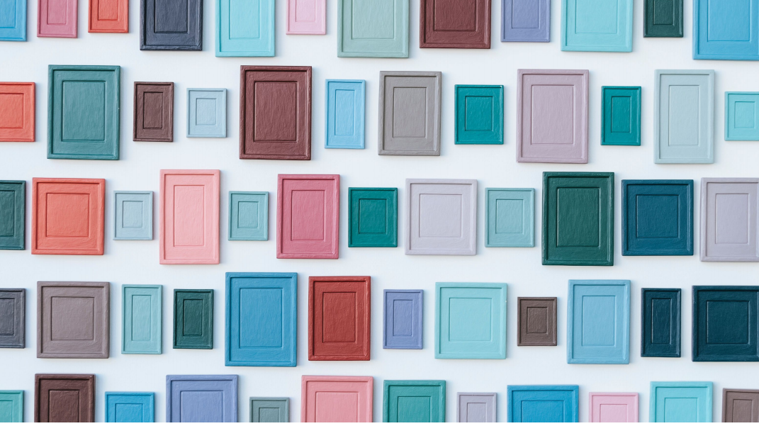
Are you feeling uneasy about colour combinations? Remember that analogue colours go well together to create a subtle merge; whereas complementary ones, make contrasting but amazing mixes.
Examples of analogue colours: green, purple, and blue / yellow, orange, and green / red, orange, and purple / red, rose, and purple.
Example of complementary colours: orange and blue / yellow and purple / red and green.
FEEL LIKE AN ARTIST!
Check out our board to see amazing creations by our clients who used Cottage Paint. Send us your creations and become a part of it!

